In this post you will find useful frameworks and plugins which will help you to build responsive websites faster.
jQuery Plugins
Blueberry
Blueberry is an experimental opensource jQuery image slider plugin which has been written specifically to work with fluid/responsive web layouts.
Response JS
Response JS is a lightweight jQuery plugin that gives web designers tools for building performance-optimized, mobile-first responsive websites. It provides semantic ways to dynamically swap code blocks based on breakpoints and serve images (or other media) progressively via HTML5 data attributes. Its object methods give developers hooks for triggering responsive actions and booleans for testing responsive properties.
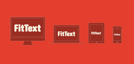
Fittext.js
FitText makes font-sizes flexible. Use this plugin on your fluid or responsive layout to achieve scalable headlines that fill the width of a parent element.
FitVids.js
A lightweight, easy-to-use jQuery plugin for fluid width video embeds.
Templates & Frameworks
320 and Up
‘320 and Up’ starts with a tiny screen stylesheet that contains only reset, colour and typography styles. Media Queries then load assets and layout styles progressively and only as they’re needed. Think of this as responsible responsive design. ‘320 and Up’ is a device agnostic, one web boilerplate.
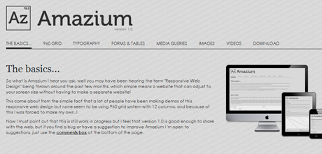
Amazium
Responsive framework based on 960 grid system.
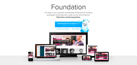
Foundation
An easy to use, powerful, and flexible framework for building prototypes and production code on any kind of device.
Inuit.css
Inuit.css framework is built to work on smaller screens (such as tablets) and tiny screens (such as phones) straight out of the box with minimal effort.
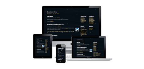
The Constellation WordPress Theme
The Constellation theme is the perfect starting point for any WordPress project. It gives you the flexibility to provide bespoke styles for different devices, totally up-to-date HTML5 code which is fantastic for SEO, a flexible grid system on top of all the other goodness bundled in to the HTML5 boiler plate.
Reverie
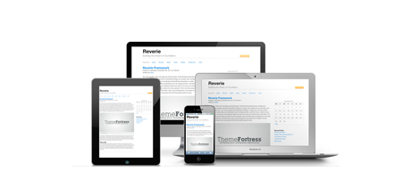
Reverie Framework is an extremely versatile HTML5 WordPress framework based on ZURB’s Foundation, a powerful tool for building prototypes on any kind of devices.
Skeleton
Skeleton is a small collection of CSS & JS files that can help you rapidly develop sites that look beautiful at any size, be it a 17″ laptop screen or an iPhone.
Gridless
Gridless is an optionated HTML5 and CSS3 boilerplate for making mobile first responsive, cross-browser websites with beautiful typography.
Simple Grid
SG is prepared for 4 distinct ranges of screen size: screens 720px, screens 720px, screens than 985px, and screens than 1235px. This means that people visiting your site will receive a layout that’s tuned to the size of their browser window.
The 1140 grid
The 1140 grid fits perfectly into a 1280 monitor. On smaller monitors it becomes fluid and adapts to the width of the browser.
Beyond a certain point it uses media queries to serve up a mobile version, which essentially stacks all the columns on top of each other so the flow of information still makes sense.
The Goldilocks Approach
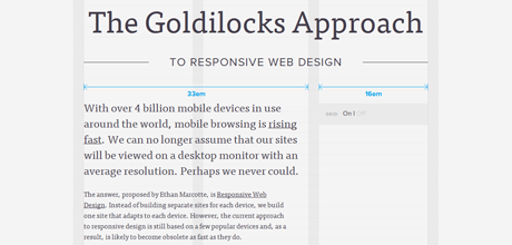
CSS and HTML boilerplate Goldilocks Approach uses a combination of Ems, Max-Width, Media Queries and Pattern Translations to consider just three states that allow your designs to be resolution independent.
Gridpak – The Responsive Grid Generator
Gridpak is the starting point for your responsive projects, improving your workflow and saving time. Create your responsive grid system once using the simple interface and let Gridpak do the heavy lifting by generating PNGs, CSS and JavaScript.
BluCSS
BluCSS is a CSS framework designed with ease of use and simplicity in mind. It is specifically made so that when you’re working on your next project, you don’t have to worry about the essentials. With BluCSS, you can be up and running in less than a minute. One feature that stands out in this framework is responsive image functionality. Just apply any “blu_” class to an image, same as any other element, and the image will automatically be resized according to the browser width.

